Today, my challenge was to design a water fountain search page. So I started with some quick ideation sketches just to get the creative juices flowing! As usual, I only have one (1) hour to work with.
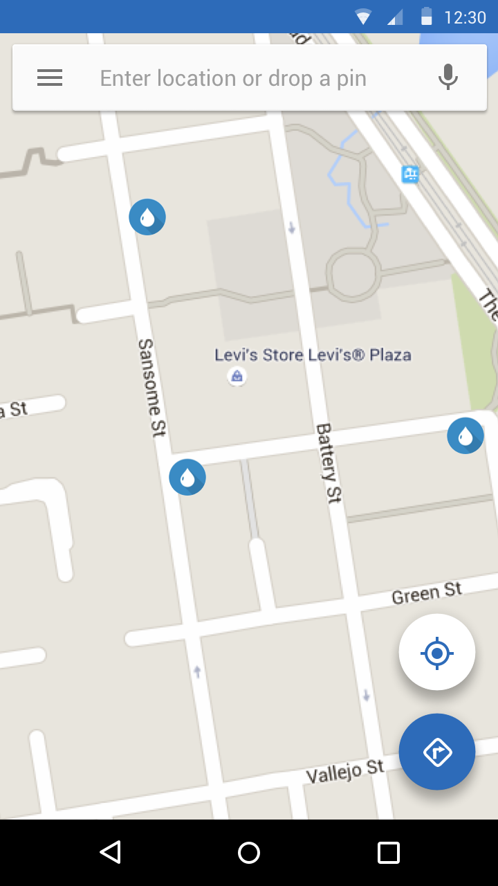
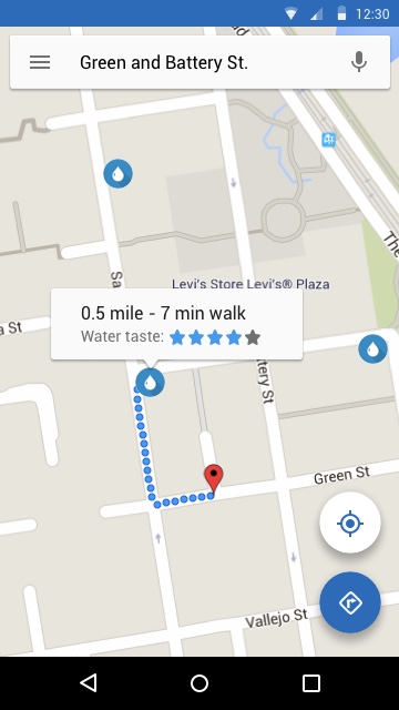
I was inspired by Google Maps and how almost intuitive it is to use! I want the app to allow a user to drop a pin to instantly recognize where they are located and give appropriate nearest location of water fountains!
Additionally, I would want the app to use Google Maps API and give a walking direction to the water fountain location. Since this is more of a blue-sky challenge, I thought it would be neat to have some social validation on the water fountain taste!
Last week, I did the UI Design Challenge using iOS Mobile UI pattern. I realize that it has been incredibly helpful for me to learn how to design in both platform. I am now taking it as a challenge upon myself to alternate each week!
Retrospective
Switching back into Material Design was a pleasant experience! As Google Material Design Guide is significantly more thorough than the iOS HIG, there were plenty of constraints that I just had to work within. From the last time I work on Material Design UI, I have read further into the guide and now understand the color principal that Material Design utilizes.
The status bar has to be 200 tint point darker than the main color used in the UI! Typically used value is 500 point for nav bar and 700 point for status bar.
I love that I keep on learning new things after every UI Challenges! Stay tuned for next Friday’s UI Design Challenge!