Outcomes.com
Dashboard Design
Project Summary
Outcomes.com is a platform that helps doctors and surgeons monitor patients outcome after treatments/procedures.
The Context
Responsive dashboard web-application
The Problem
Currently, the dashboard page for Outcomes.com does not display actionable information at a glance. Surgeons are busy!
The Project Goal
Help surgeons make informed decision through Outcomes.com’s display of actionable patient data.
The Constraints
Limited timeframe: 6 weeks
Pre-product market fit project with limited initial user data
Very specific target user (surgeons)
Role
Design Team Lead
Wireframing & Prototyping
Methods
- Hypothesis driven
- User research
- Usability studies
- GV Design Sprint
- Prototyping
- Validation test
The Results
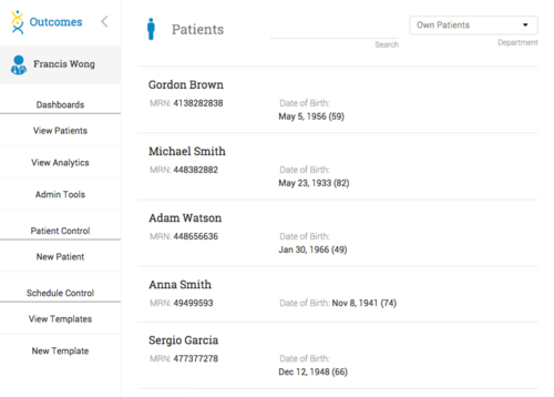
Before
After
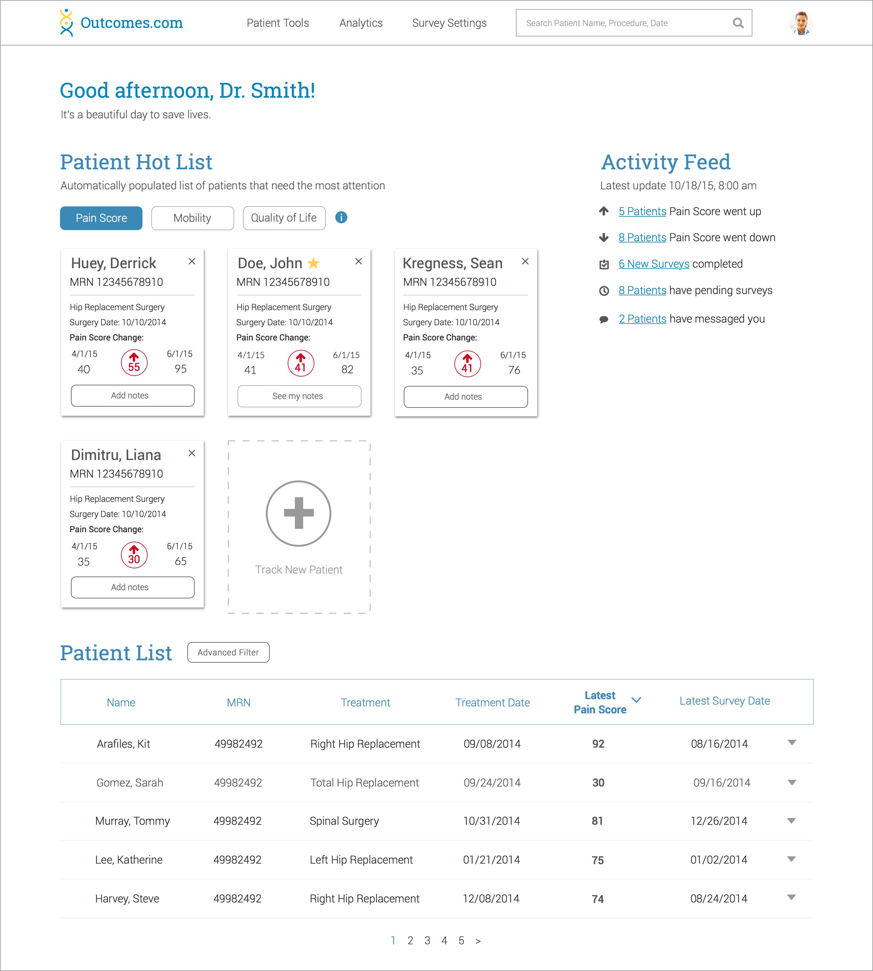
Our design recommendations resulted in a 100% increase in the users’ ability to quickly pin-point which patients need help and which one is doing well.
Client Feedback
From Francis Wong, Founder
Mischelle and the Tradecraft team did an incredible job for Outcomes.com, helping redesign core parts of our physician facing dashboard. Specifically, Mischelle led the design sprint which started out by involving us in the ideation and rapid prototyping process – it was a lot of fun and incredibly productive. She played a crucial role in developing the clickable prototypes that they then tested with physicians and healthcare providers.
The team took what was a big and unstructured problem and used a methodical and data-driven approach to come up with novel solutions with a strong attention to detail. They were very professional and acted with initiative, keeping us involved and engaged with their process.
I strongly recommend Mischelle and hope to work with her again in the future! We’re excited to be moving forward with her team’s work!
Let’s dig deeper:
Project Breakdown
Selected design process:
- 1 -
Understand
- Provisional persona
- Jobs to be done
- User interviews
- Create hypothesis
- 2 -
Experiments
- Usability studies
- Card sorting
- 3 -
Design
- Synthesized experiments results
- Ideation process
- Comprehension test
- 4 -
Validate
- Clickable prototype
- Validation usability studies
- Evaluated metrics
1. Understand the Context
To help us understand our user (doctors and surgeons), we conducted thorough user research by developing provisional persona, utilizing ‘jobs to be done’ framework, and ultimately validating our target user persona through comprehensive user interviews.
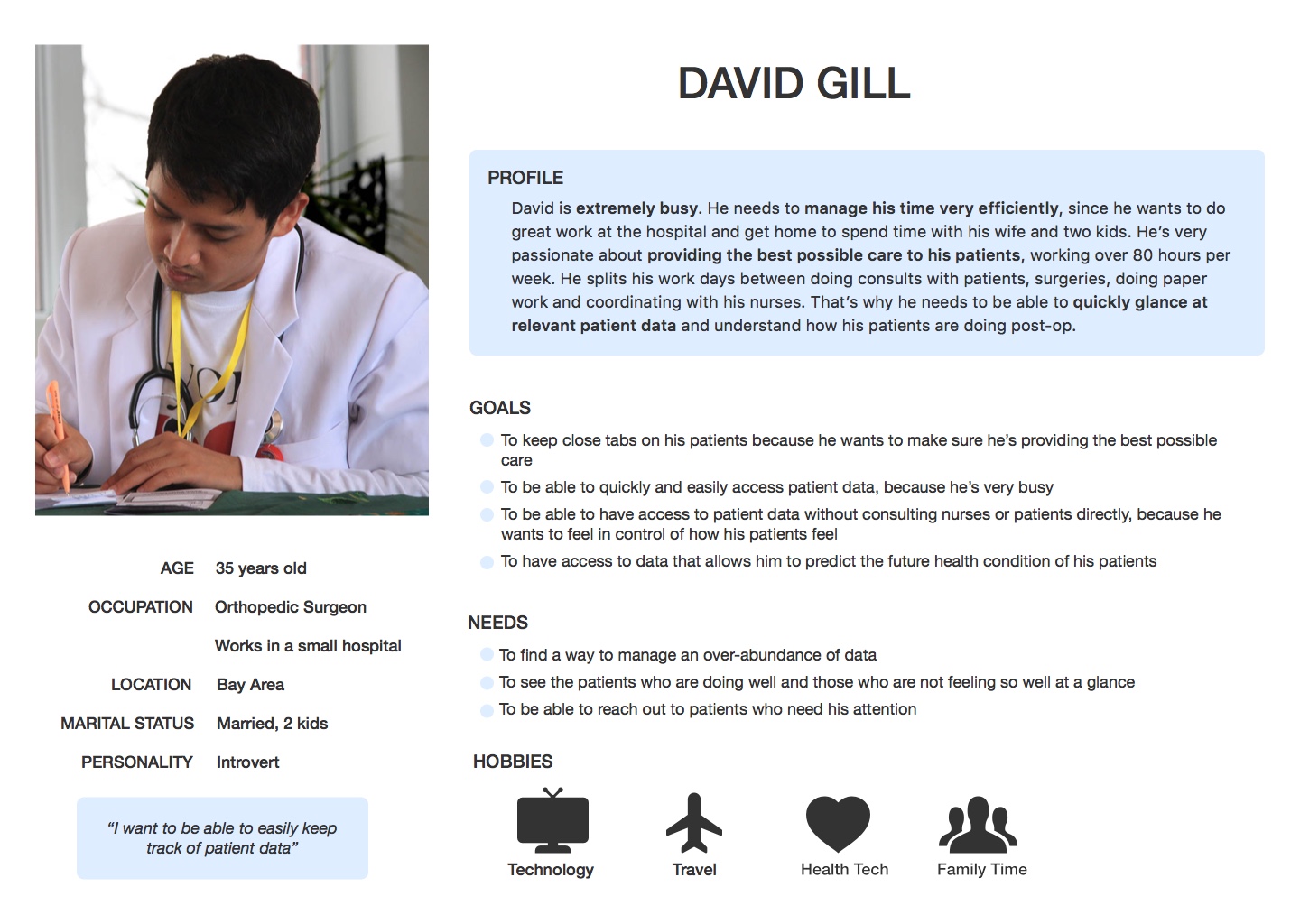
Provisional Persona
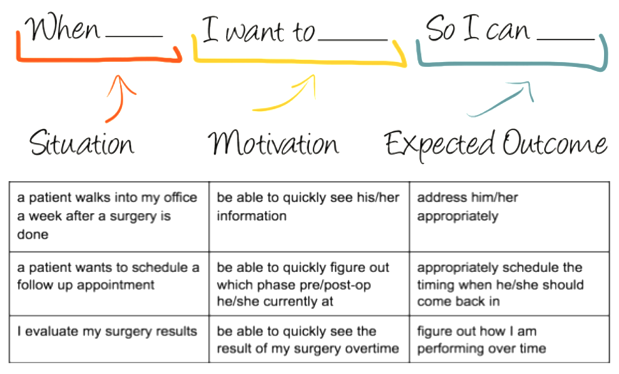
Jobs to be Done Framework
We followed the “jobs to be done” frameworks to develop Job Stories in order to better understand the different scenarios that doctors and surgeons go through when they are accessing Outcomes.com.
By understanding this context, we were able to focus the goal of our design process and design informational interview questions that will help validate or invalidate our assumptions.
Informational Interview
 We drafted an interview script based on our research objectives we assumed above to validate with doctors.
Hypothesis Formulation
Based on our user research process above, we were able to formulate the hypothesis below:
Proposition: Display actionable patient data at-a-glance
Hypothesis:
We believe that making it easier and faster for doctors to discover patients who needs help will increase overall engagement and functionality of Outcomes.com.
We will know this is true when we see a significant increase of more than 20% of doctors be able to quickly determine the status of their patients on their dashboard.
2. Experiments
We ran two different experiments on this particular project detailed below:
Usability Studies

Key insights:
- 5 out of 5 users could not identify which patients were doing poorly
- 4 out of 5 users had difficulties navigating back to the home page
- 5 out of 5 users liked seeing a graph, but had difficulty understanding it
- 5 out of 5 users wanted to have the capability to customize patient list
- 5 out of 5 users did not understand the use of metrics and color
Open Card Sorting
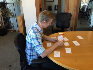 We deconstructed all of the information available on Outcomes.com and asked five users to sort and organize them in a manner that makes the most sense to them. The results of this experiment gave way for a site informational hierarchy that we implement on our design recommendation.
3. Design
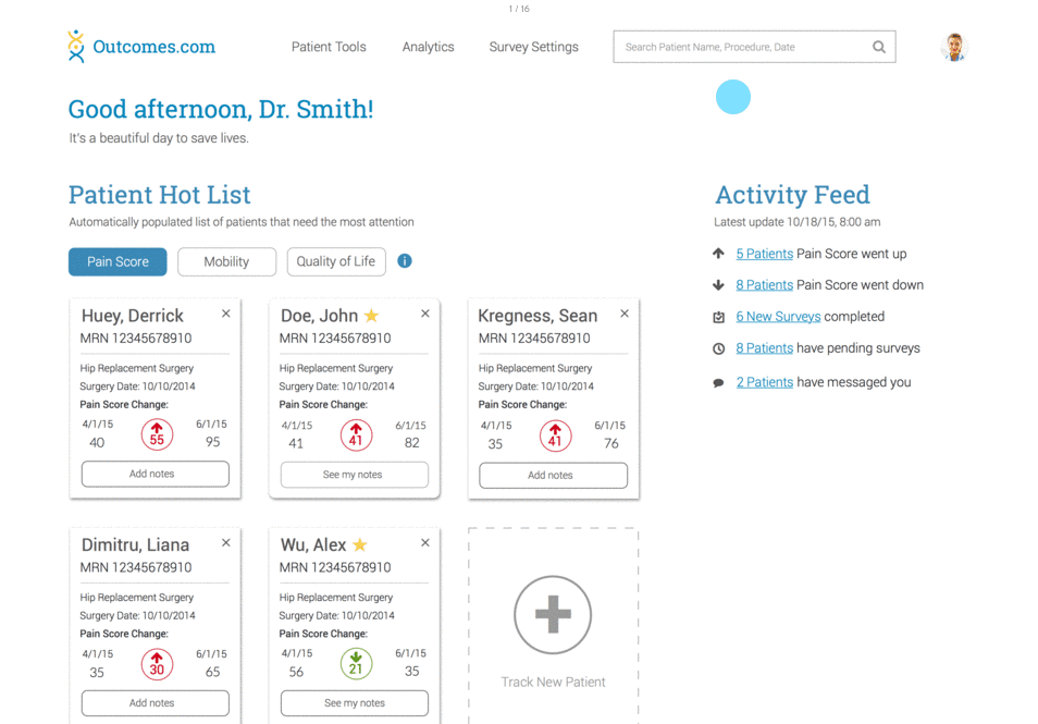
Based on the results of our user research and usability studies, we uncovered that doctors and surgeons will not spend the time to dig through Outcomes.com platform to find patients who need help. Instead, they would like to see actionable information as soon as they land on the home page. This key insight led us into combining the information from Patient Dashboard and Patient Treatment Page into an easy to digest and actionable at-a-glance on the home page.
Our first step is to ideate.
As the Wireframing and Prototyping Design Team Lead, I structured and led Google Ventures Design Sprint to uncover varieties of solutions to address the pain points.
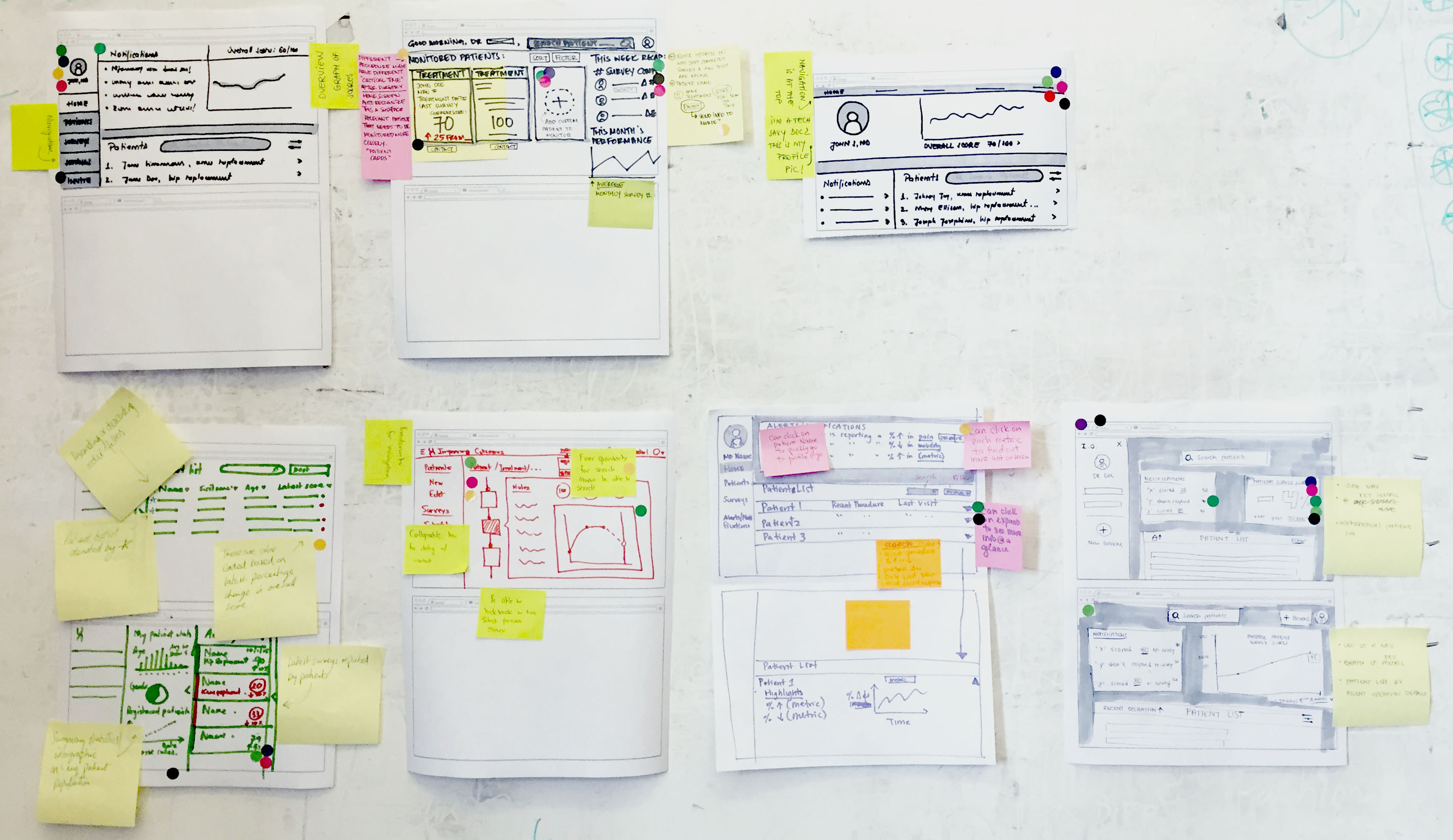
Both Outcomes.com founder and developer were involved in our design sprint!
Then, we wireframed the sketches using SketchApp.
We went through several rounds of iterations and testing before deciding on the final design recommendations.
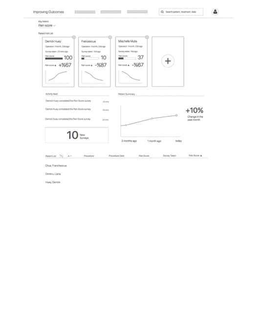
Patient Card Comprehension
One of the biggest challenge in our redesign was to develop a visual communication tool that displays the right patient data for doctors and surgeons to take action upon. We sketched several solutions for this problem and ultimately decided on the design of the ‘Patient Card.’
This was especially challenging because we wanted to be sure that doctors can understand what kind of information they can see at a glance. Thus, we ran comprehension tests on several version of the cards before deciding on a final iteration.
Varying options
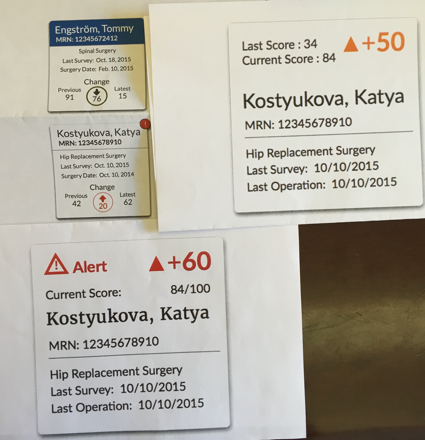
Patient Card Anatomy

Interaction & User Flow
After showing the patient cards and our early wireframes with doctors and surgeons, we observed the need for them to be able to customize the patient card list. Doctors and surgeons would like to be able to add and remove patients from the Patient Card list as necessary.
Thus, we designed an interaction flow that allows doctors to do so.
4. Validate
Clickable Prototype
We went through several rounds of validation for this project as partially detailed above. We deliver the result to our client in the form of a high fidelity clickable prototype.
Final usability study test
We took our last iteration into our final validation usability test to further uncover additional insights that we can address immediately.
Results:
- 3 out of 5 would like to see a graph showing a trend in data
- 3 out of 5 users had trouble comprehending the hot list
- 4 out of 5 users wanted more clarity and customization for the patient list
- 2 out of 5 users prefer using the 1-10 pain scale (instead of the 1-100)
- 2 out of 5 users weren’t sure who is responsible for adding notes
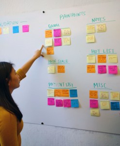
We plotted these pain point categories into affinity maps to determine which feature is the ‘lowest hanging fruit’ and will result in the highest impact to be iterated upon.

Final Design Recommendations
Our design recommendations resulted in a 100% increase in the users’ ability to quickly pin-point which patients need help and which one is doing well.

Next Steps
We delivered the final clickable prototype including all of the assets used in the final design recommendations. Outcomes.com team is currently in the process of implementing our design recommendations.
Furthermore, Outcomes.com will be joining the UC Berkeley’s own start-up incubator, Berkeley Skydeck to further develop Outcomes.com.
Our lovely team!!