JET
UX Audit on iOS App
Project Summary
JET is a new e-commerce site that takes advantage of the power of annual member subscription to provide lower daily price for its members.
The Context
UX Audit of JET’s iOS application
THE PROBLEM
Currently, JET’s first main call to action ‘Shop’ leads the user to the product category page. As most users are unaware of which category exactly is the product they are looking for, some of them were led astray and they ended up leaving the app frustrated.
THE PROJECT GOAL
Empower users by designing a seamless searching experience to help them find exactly what they need as fast and as accurate as possible.
THE CONSTRAINTS
Limited timeframe: 2 weeks
$0 budget
As this was a UX audit project, I was working with little to no insider information from JET
Role
Sole product designer.
Methods
The Results

Based on a one-click test, my design recommendations resulted in a greater than 40% increase in the chance of users’ ability to find the product they are looking for—compared to the initial guerrilla usability test result.
(increase from 54% to 100%)
***
Notes: At the beginning of my testing, I contacted JET to share my research findings. In the end, I presented my findings through a comprehensive video conference with one of the Project Managers from JET. She shared several internal insights that were really helpful in giving me a better understanding of the company’s constraints and the bases of their design decisions.
Let’s Dig Deeper:
Project Breakdown
Selected design process:
1. Hypothesis Formation
HYPOTHESIS: Find product faster and more accurately
I believe that making it easier and faster for a user to find the product they are looking for will increase engagement and potential sales.
I will know this is true when I see a significant increase of more than 20% of users be able to find the product they are looking for in under 30 seconds.
The three steps below helped me formulate the main hypothesis that drove the rest of my usability experimentation.
Provisional Persona

I wanted to understand the motivation that the users have when opening JET, the task that they are trying to accomplish, and what are the consequences that happens as the result of using the application.
This provisional persona was created based on the preliminary research and understanding of the target user of JET.
Competitive Analysis: Amazon.com
I interviewed 5 current Amazon.com users and asked them some basic questions:
- what do you use Amazon for?
- why do you like using Amazon?
And the major consensus answers were listed below:
- 5 out of 5 people said that:
it has reviews! - 4 out of 5 people said that:
Amazon has everything!
it’s so easy to find what I need - 3 out of 5 people said that:
there’s no need to go elsewhere to find information
Existing User Flow

2. Experiments
Guerilla Usability Studies

Test Scenario
Find the best value vacuum cleaner
Imagine that your vacuum cleaner just broke and you are in the market for a new vacuum cleaner. You are interested in purchasing the best vacuum you can buy on a budget. Your friend told you about a new thing called ‘Jet’ that has really good deals, show me what would you do to find it.
Test Results
Testing Snippet

User Comments
” What if I can’t find it? “
” There’s a search button?! “
Time it took her to find the vacuum page: over 1 min 30 sec
Test Notes

Here is the number:
- 1 out of 7 have heard of Jet
- 3 out of 7 would rather use Jet as a starting point, then go to Google or Amazon to read reviews & potentially buy
- 7 out of 7 experienced issues surrounding product information page
- 4 out of 7 users were unable to immediately find what they were looking for
- 6 out of 7 experienced searching issues
Ultimately, users were not able to find what they were looking for!
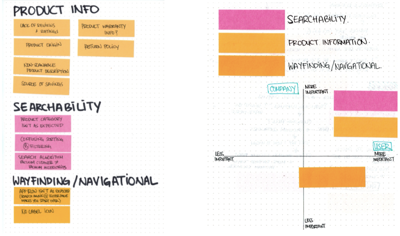
Data Analysis: Categorized Pain Points & Affinity Map

Affinity map helps me decide on which pain points to address first. Although 7 out of 7 users were looking for product reviews, I had to prioritize the critical issues first. In this particular case, users will not even arrive at the product review problem if they are unable to find the product that they are looking for.
Therefore, the most important issue to address is: searchability
3. Design

I referred back to the initial Hypothesis in the creation of JET’s Design Story. In order for me to be extremely thorough with my design decisions, I created a list of all the elements that need to be addressed in my redesigned to successfully help user find product faster and more accurate.
Uncover design opportunities through user flows
Below is the modified user flow. The yellow lines represent potential design opportunities that I further explored during my ideation step.

Ideation

Just keep sketching...
I spent the first couple of sketches drawing everything in the proper scale of an iPhone 6 screen. However, I realize that I was limiting myself from the ability to iterate quicker.
So on the second round of sketches, I decided to start drawing smaller and faster with the main goal of putting down as many iterations as fast as I can.

After sketching several ideas, I spent some time going back to the user flow and using dot stickers, I identified which ideas can potentially solve which pain points.
The winning solutions were the ones that solve more than 1 issues at a time.
These selected solutions were then brought into high-fidelity prototypes and went through several rounds of iterations before arriving at my final design recommendations.
Design Recommendations
Goal: improve overall searching experience
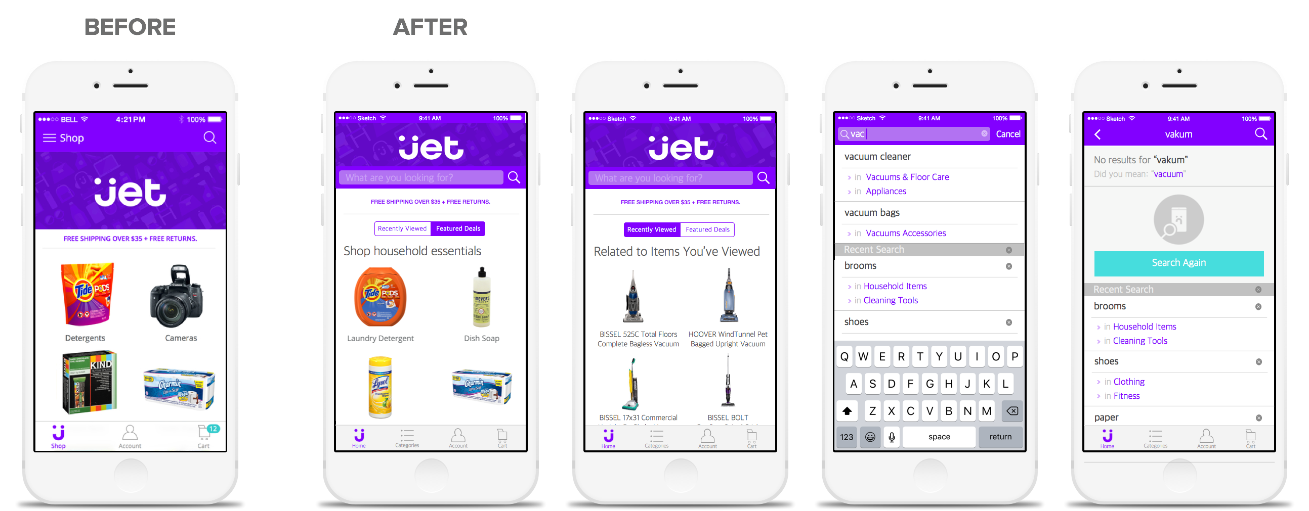
1. Make the search bar more prominent by treating it as the main call to action on the Home Page
2. Display recently searched and viewed products on home page

Here is how I imagine the interaction of the new home page will be:

3. Smart default sorting on Category Page: alphabetically
- future opportunity: learn users’ interest over time and push categories that are more relevant to them to the top of the page
4. Display search icon on Category Page
- provide a quick way for users to go back into ‘searching’ mode if they are unable to find the relevant category of the product they are looking for

5. Display past and recent search queries used on empty searching state
(when user tap on search to begin searching)
6. Display both categories and sub-categories on search results
- provide a quick way to help user refine their search (for example: shoes under fitness category will inherently yield different results compared to shoes under clothing category)
7. Use Predictive Text to quickly provide suggestions to users

8. Utilize ‘empty searching state’ page by displaying past/recent search key terms
9. Provide a quick way to help understand why they land on this particular page
10. Provide reasonable suggestions based on the current search query used

11. Enhance sorting and filtering interaction

Here is how I imagine the interaction of the new filter and sorting feature will be:

4. Validate
Clickable Prototypes
I decided to create 2 different clickable prototypes in order to display both conditional situation that might arise during user’s process of finding a specific product.
Success Search Flow
Failed Search Flow
One Click Test
I took the ‘Success Search Flow’ prototype out into the wild and ran a One Click Test using the same scenario from the initial guerrilla usability test.
I approached 7 users and told them the same scenario.
The Results
Based on a one-click test, 7 out of 7 users would go directly to the search bar in order to accomplish their task (finding a vacuum cleaner)
This is a greater than 40% increase in the chance of users’ ability to find the product they are looking for—compared to the initial guerrilla usability test result (increase from 54% to 100%)
Next Step
By the time I presented this project to a PM from JET, the iOS application has gone through so many rounds of iterations and therefore no longer look like the version that I worked on! Even so, through my conversation with Lizzy Kiat (a PM at JET), I learned that there were plenty of internal constraints in play when JET launched their first couple versions of iOS app.
With new information on hand, the next reasonable steps is to run a similar test on the new version of the app and see if similar issues still persists.
Reflection
Working on JET iOS Application taught me to never be afraid to reach out to someone from the company for the product that you are analyzing! Not only that I was able to present my findings to real stakeholders, I was also able to learn more internal constraints and understand the reasonings behind why specific design decisions were made.