WeTravel
Information Architecture & Interaction Design
Project Summary
WeTravel.to is an online travel and trip organizer tool. WeTravel.to empowers trip organizers by providing them with an easy way to create a landing page for their trips, collect money, and invite travelers.
The Context
Responsive web-application
The Problem
Currently, the onboarding and Trip Creation experience for trip organizers is quite confusing. There is no clear signifiers that notifies the user where they are in the overall Trip Creation process.
The Project Goal
Design a frictionless Trip Creation experience for trip organizers.
The Constraints
Limited timeframe: 6 weeks
Requirement to stay within a specific page layout
Role
Design Team Lead
Information Architecture
Methods
The Results
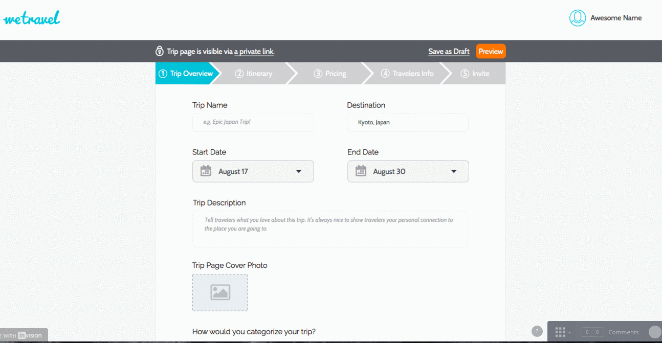
Before
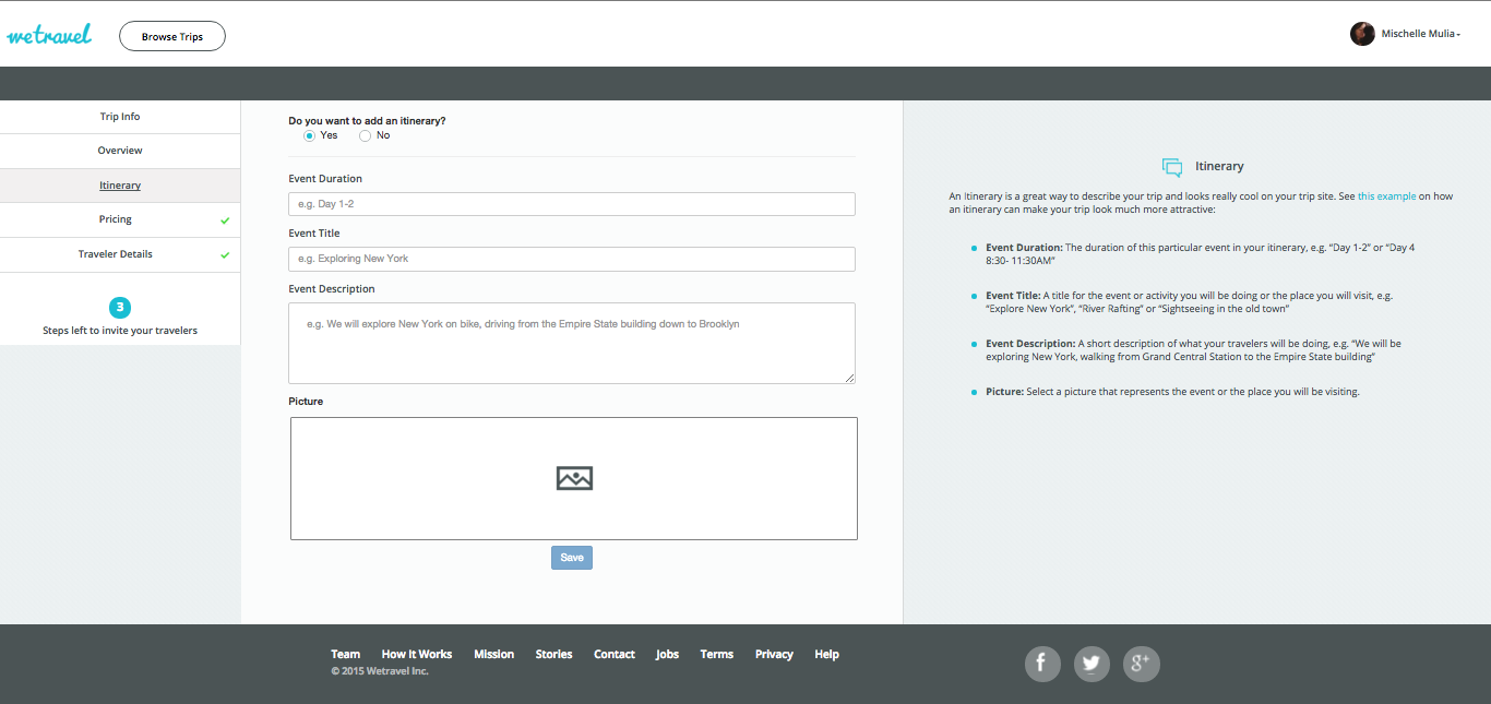
After
Our design recommendations resulted in a 40% increase in the users’ ability to complete the entire process of Trip Page creation without getting lost along the way, we have not only validated our hypothesis, but also exceeded our expectations as well.
Let’s dig deeper:
Project Breakdown
Selected design process:
1. Hypothesis Formation
HYPOTHESIS: Create a Trip Page easier and faster
I believe that making it faster and more intuitive for a user to create a Trip Page will increase the number of trip organizer users and overall number of trips listed on the site.
I will know this is true when I see a significant increase of more than 20% of users be able to complete the entire process of Trip Page creation without getting lost along the way.
The three steps below helped me formulate the main hypothesis that drove the rest of my usability experimentation.
Existing Interaction Flow

On the left is the start-to-end process that a typical user has to go through in order to create a Trip Page on the existing product.
Provisional Persona
We created provisional personas based on preliminary understanding of the product’s typical user base.
Persona 1: Public Trip Organizer

Persona 2: Private Trip Organizer

2. Experiments
We ran two different experiments on this particular project detailed below:
Usability Studies
Results–The number:
- 3 out of 5 users could not successfully navigate the itinerary section
- 3 out of 5 users did not comprehend the differences between Public and Private trips
- 3 out of 5 users wanted to know what commission meant and why they couldn’t use it to make money
- 3 out of 5 users did not clearly understand which step they were on in the trip creation process
- 3 out of 5 users were not confident that they had successfully completed the trip creation process
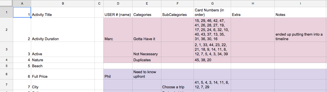
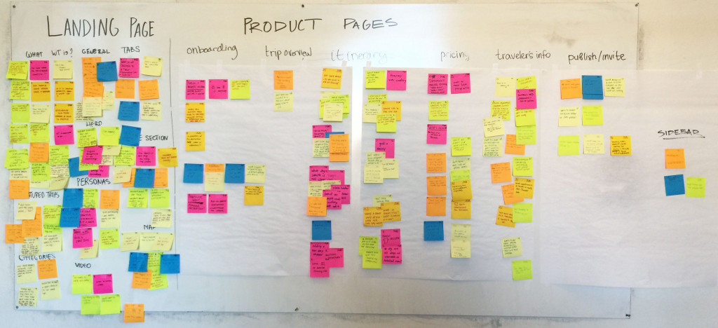
Card Sorting
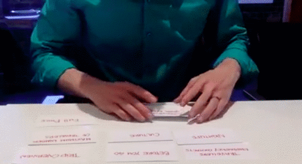
Results:
Card sorting helped us uncover a grouping pattern amongst our users. Additionally, we uncovered that users grouped items according to the sequence of questions they would like to be asked.
Below is a snapshot of the recorded results of the test. We numbered each card so we can quickly record each users’ categories on the spot.
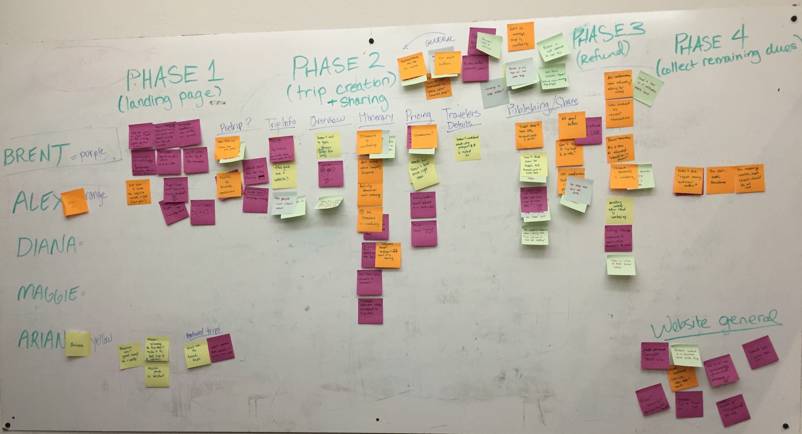
3. Design
The complexity of this project required us to split up our design process into three parts.
*****
Part 1: Synthesized Insights to Uncover Design Opportunities
First, we identified the pain points from usability test that can potentially be addressed by improving the site’s overall structure and interaction.
See bolded items below:
- 3 out of 5 users could not successfully navigate the itinerary section – structure & interaction
- 3 out of 5 users did not comprehend the differences between Public and Private trips – structure & interaction
- 3 out of 5 users wanted to know what commission meant and why they couldn’t use it to make money
- 3 out of 5 users did not clearly understand which step they were on in the trip creation process – structure
- 3 out of 5 users were not confident that they had successfully completed the trip creation process – structure & interaction
Thus, we can potentially address 4 out of 5 pain points.

Second, we developed a dendogram (tree-diagram) that draws relationship and pattern between each users’ categorization and labels.
On your left is the raw dendogram and below are the annotated dendograms based on qualitative analysis during the in-person card sorting exercises:
Groupings annotation
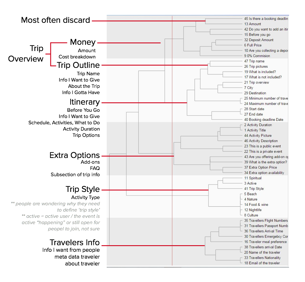
Special case items annotation

Third, we identified that users sequenced items in the order of how they would like to be questioned. We also noticed that users grouped items according to Public or Private Trips.
We used the results from the three process step above as the basis for ideating solutions via the GV Design Sprint.

We use the results from the three process step above as the base of our Ideation Step.
Part 2: Ideate
Google Ventures' Design Sprint

We ran several rounds of quick and dirty iteration sketches and here are some of the results from the design sprint:

From our design sprint, we decided to explore:
- Two types of navigation systems:
a. improved side bar navigation
b. top bar navigation that displays progress along a timeline - Two types of itinerary pages:
a. utilize google calendar like pattern of adding itinerary events
b. utilize card pattern, similar to the results of the itinerary items on the final trip page - Better ways to help users differentiate Public and Private trips
- Better arrangement and language of items
Part 3: Iterate
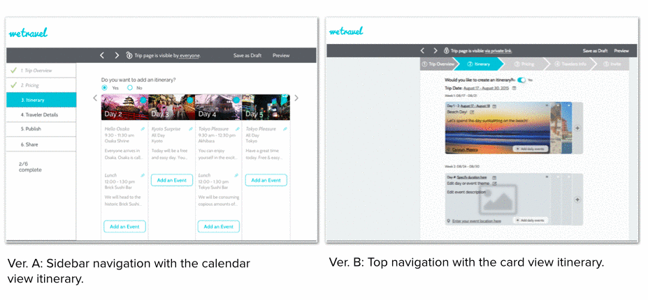
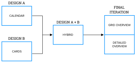
#1 : Design A & Design B
We began our exploration with 2 different designs that will eventually converge based on the results of our testing.
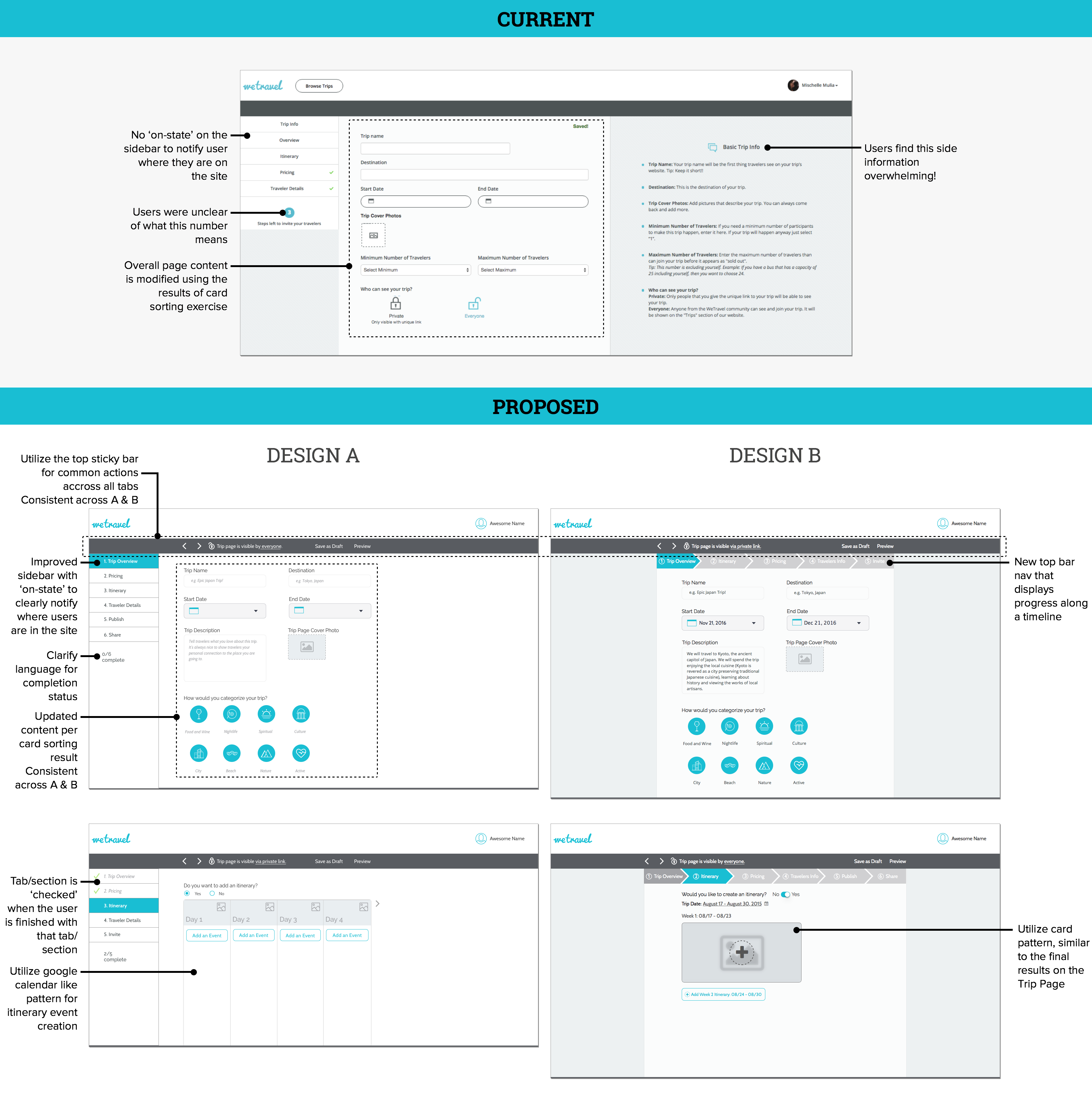
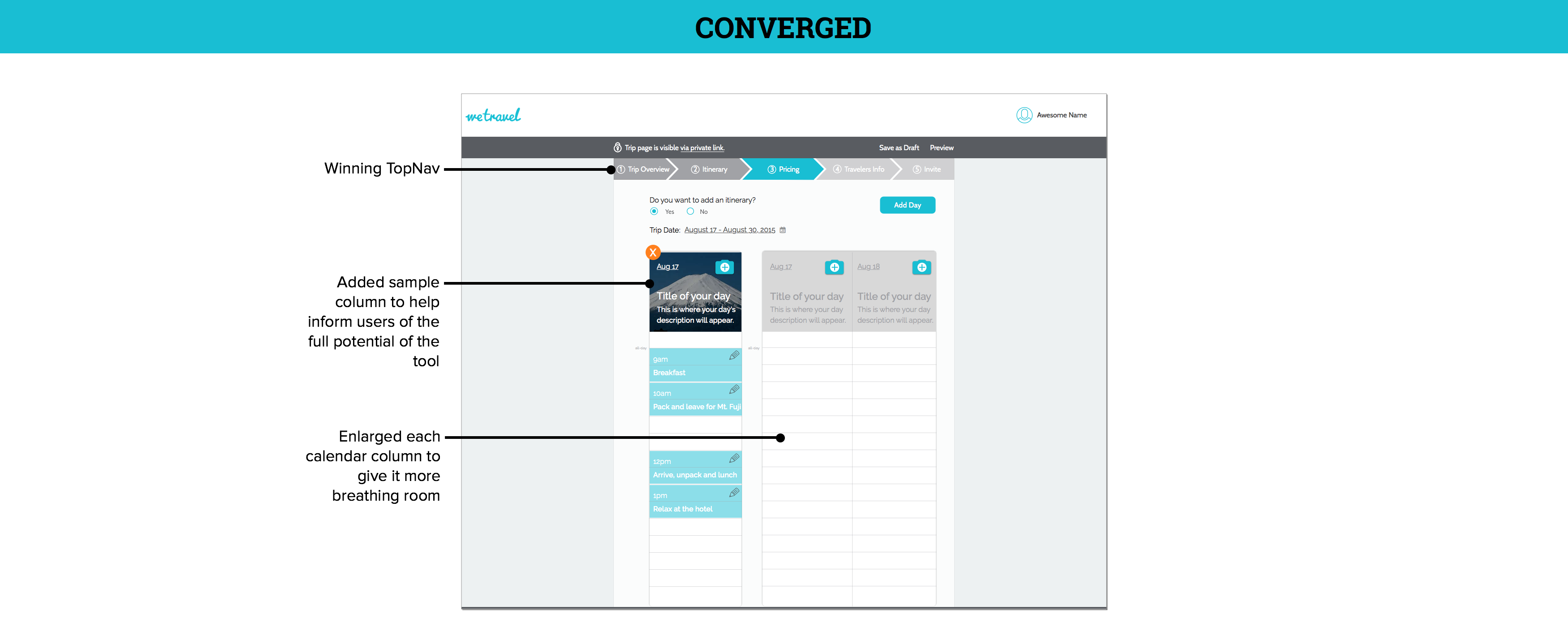
We tested both versions separately and discovered that there was a clear consensus of preference for the TopNav on Design B because it better illustrates progress along a timeline.
However, for the itinerary pages, although users were familiar with Design A’s google calendar pattern, most were still very impressed by the impact of the large image use. Thus, we decided to move forward with a hybrid of Design A’s and B’s itinerary page pattern.
#2: Converged Design A & B
Below is the very first version of the converged design!
Here is a quick animation illustrating the merge of the two designs:
#3: Itinerary Iterations and Interactions
 We tested our new hybridized itinerary page on five users and discovered that some users wanted to see detailed itinerary info while others preferred to see an overview. We therefore decided that the best way to cater this was to create a toggle button that switched between the detailed & overview states
Annotated version of both pages (Overview and Detailed View):

I spearheaded the creation of a UI Flow diagram to identify how each screen within the itinerary page related to each other.
This diagram illustrates several functionality listed below:
- It displays how one can flow through the entire itinerary process
- It demonstrates the logic and the why behind each interaction movement and consequences
- It displays all the available alternate flow depending on what the user decides to do
- It explains how the page will handle multiple cards on overview page
- It explains how the page will handle multiple calendar rows on detailed page
- It explains the behavior of the ‘Event Date’ that shows up on each new card/calendar column
- It displays the flow with the understanding of the scale of detail for each interaction level
Click on the image to see it in full size.

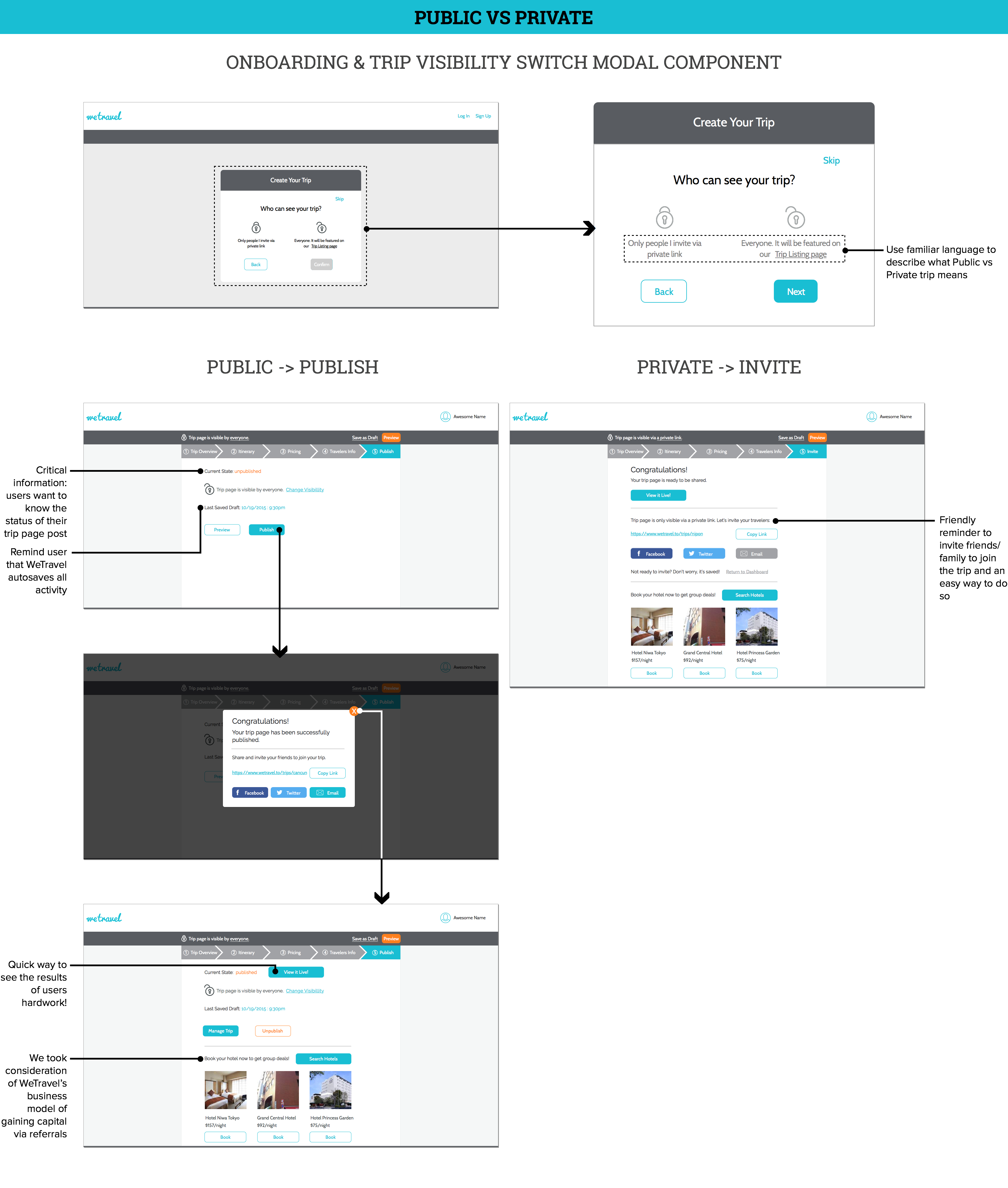
#4: Public vs Private
Design recommendations to help users differentiate between Public and Private Trips:
#5: Overall Content Language and Location
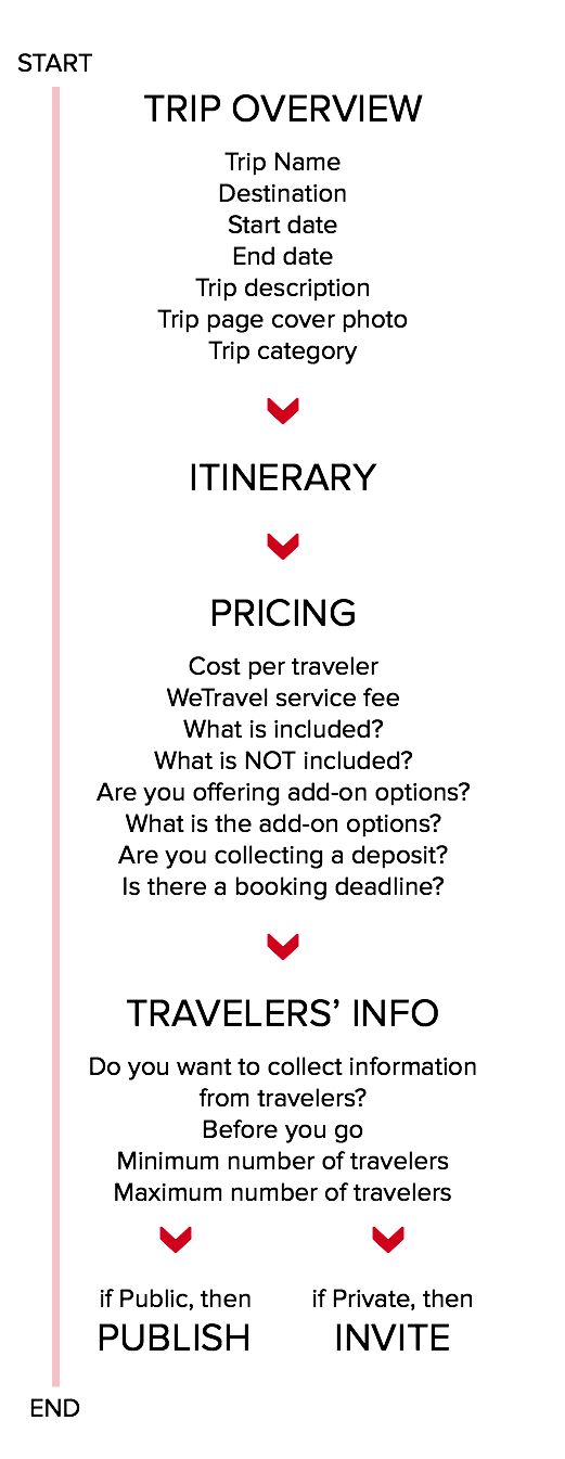
On the left is the final sequence for the entire Trip Creation Process. Several items have been rearranged to fit users’ mental models based on the results of our card sorting exercises. We also modified the language for some items to help clarify the intent of the questions.
4. Validate
Clickable Prototype
We went through 3 rounds of validation for this project as partially detailed above. We deliver the result to our client in the form of a high fidelity clickable prototype.
Final usability study test

The scenario for this final test has been altered to help us validate our design decisions (see left image). This final scenario was designed to be more thorough and asked each users to use the tool to its maximum capabilities.
Results:
The number:
- 5 out of 5 users were able to successfully navigate through the itinerary section with no difficulty
- 5 out of 5 users were able to clearly explain what the difference between a Public and Private trip was when questioned
- 5 out of 5 users understood what the WeTravel Service Fee meant
- 5 out of 5 users were able to successfully navigate through the process with clear comprehension in terms of how many steps were complete and how many were left
- 5 out of 5 users were able to publish or invite travelers to their trip without any doubt
Ultimately, we were able to change the metrics from having 3 out of 5 users experiencing pain points into a successful 5 out of 5 users who were able to navigate through the initial issues with zero problem.
As this is a greater than 20% increase (at 40% increase) in the users’ ability to complete the entire process of Trip Page creation without getting lost along the way, we have not only validated our hypothesis, but also exceeded our expectations as well.
Next Steps
We delivered several next actionable steps that WeTravel internal team could potentially address in the near future:
- Itinerary: Adding on-calendar editing and adding capabilities to follow existing patterns from calendars such as iCal and Google Calendar.
- What does the traveller see?: Some organizers mentioned that they have no idea what their travelers see, and it will be good for them to view a preview that page.
- Adding more days: In the current itinerary grid, the next available date pops up for you to add a new day theme. Adding a + button that allows organizers to add more days can be considered.
Reflection
Working with a generally larger team was definitely challenging. As a Design Team Lead, it was crucial for me to be able to find my place and responsibility in between the team member and the project manager. Challenges aside, working in a larger team means that we were able to tackle a much larger scope of the project and I was able to wear both hats: leader and team member within one project!
Here is all of us, along with the founders of wetravel.to and champagne cups on our hands!

Client Feedback
From: Johannes Koppel, Founder
Mischelle was part of a select group of Tradecraft designers working on a design & user testing project for WeTravel Inc. The team exceeded our expectations by far. First, they executed an incredibly thorough and insightful user research, efficiently identifying the weak points of our current product design. They then proceeded to rapidly prototyping dozens of versions of our landing page and product design, constantly testing the iterations with real users. The final outcome, a fully redesigned landing page and product, was nothing less than stunning. Initial user feedback is extremely positive and has led to a huge increase in conversion on our site.
During the whole process, we were blown away by the team’s professionalism. They worked independently, all while finding the right balance of getting our input, only consulting us at critical junctions of the project. Mischelle in particular displayed an incredible drive and worked hard to perfect the product, all while never surpassing a deadline. The quality of the work delivered far exceeded anything that we have experienced from working with other freelance designers and even established design agencies.